
Winamp 2.X skinning tutorial
Chapter 3 - Graphical Files
Graphical Files
The graphical part of a skin usually consists of 16 bitmap images.
If you need to take a look at Winamp Base Skin’s images, download them here: ftp://ftp.winamp.com/winamp/nsdn/baseskin.zip. If you don’t like the default winamp skin (as I do), because it’s useless, then download the template skin. A template useful for extraction is located here: http://www.deviantart.com/deviation.php?id=69250. Note that it’s a PSD file, so you might have to convert it to another format if you don’t use Photoshop. Btw, already mentioned Irfan View could do this converting. Thanks to Regener8ed for the last two links.
And now you might read a description of (almost) every graphical file, which could be found in a skin’s folder. Btw, don’t forget to visit http://fyreskins.plastiqueweb.com/ for more info about this stuff.
AVS.BMP
The Advanced Visualization Studio window is one of the easiest windows to skin. It consists of one image only and is very easy to create. Note: unlike MB or PL, AVS uses resize for the borders instead of tiling.
The blue rectangle on the top is the only header (active and inactive). It’s non-resizable, so you may use for an inscription or so. Note: a header will always be located on the top-left. The red square on the right is a header’s resizable area. So, when you enlarge your AVS window, this square will be tiled. The rightmost square is the AVS “close” button (the leftmost top area is a pressed close button). A row below the footer (left to right): black stripe, magenta and orange stripes are footers, which are located below the header and follow the same rules: the magenta rectangle is resizable and the orange one is the bottom left corner of your AVS window. You may draw something there to show that it could be used to adjust the windows’ size. The two vertical rectangles on the left of the image are the left (the left one) and right (the right one) borders of the AVS window. Just note that they are resizable too and located between header and footer.
The green square in the right top corner is the ‘close’ button. Sometimes a pressed ‘close’ is placed in the top left corner of the window, but it isn’t really displayed anywhere on the skin (bug?)
BALANCE.BMP
This is the first interesting control element in winamp skin’s format, as it allows you to use do some cool tricks with it. It has 28 background rectangles for different states of balance, and two rectangles below them, which are sliders - green is used for normal display and red is pressed.
The most primitive way to create balance is to make no animation with it. For example, you draw a simple stripe and a slider which is moving on this stripe. No special knowledge is needed to make it. A very trivial solution.
Classical balance also has a slider or so, but the stripe changes its size or color while sliding. You could use a simple animation, but not too much, as a slider button’s image could be a hindrance for this. The principle of making animation is: center balance’s state (no balance shift) is the highest in balance.bmp image. The maximum shift is the lowest part of the image and there’s no difference if you’re moving a balance slider left or right: they will be the same.
A modern way of creating a balance is used mainly by advanced skinners and it provides you with a better result than the previous ones. All you need is just to crop your image in order to cut sliders, which are located on the bottom. Now you have 28 positions - independent states of your balance slider. So you are not limited in animation as before: you could make a slider of any size (inside a form) and shape. For example, I’ve used this method in my Ballzzz (http://sacrat.deviantart.com/gallery) skin series to create a slider in the shape of a ball. There are more interesting solutions, like knob (Nucleo_NLog skin), but most of the people still prefer to use sliders of different kinds. Don’t limit your imagination: you could display digits, could make your own slider move in almost any direction, give it almost any shape (not just a rectangle moving forward-backward).
Hint: don’t remove the empty field on the left of the image (marked blue on our illustration): it’s necessary for the balance to be displayed properly.
Here and below remember one important rule about cropping the images: each image is placed based on its top-left corner, so if you wanna reduce the size of a picture painlessly, you can only remove its bottom and right parts.
If you don’t wanna make a balance slider, you could crop the image after extraction, as described above, and leave it this way: you’ll see no animation while moving the slider.
If your volume and balance sliders look exactly the same, there’s no need to create balance.bmp at all! Winamp will use volume.bmp for the balance slider.
CBUTTONS.BMP
This image contains control buttons: previous track, play, pause, stop, next track and eject in two states: normal and pressed.
What you need to remember: normal state buttons are on the top, and pressed - on the bottom.
Note that the eject button is one pixel thinner than the rest of the buttons and that the bottom eject button is one pixel lower (relatively to other buttons) than the upper eject. So be careful if you just copy buttons. What kind of animation to make? Anything you want. Most of the skinners choose one of two animations: “normal button - highlighted button” or “normal lever - activated lever”. There’s not too much to chose from. Hint: you could make your buttons bigger, but the area, which could be changed, will still be limited by the size of the cbuttons.bmp image. Also keep in mind that you can change the form of your buttons (but don’t forget that the true area of each button is still a small rectangle), so they won’t look like classical rectangles, you may even leave them with no borders. Take a look at: Vida, blade, Blornge, Blue jeans, Blueprint and so on.
If you don’t want any animation, you can crop this image to 1 pixel - then only the buttons from main.bmp will be displayed (but read the Animation paragraph first, - note by SacRat).
EQ_EX.BMP
An image which has the winshade windows of the equalizer. Winshade is a mode when you minimize the window into a tiny stripe, which doesn’t take much space on your desktop. The “active” state (when it’s in focus) of the window is above. The buttons, which are marked white, are active and black - inactive. A big black rectangle is a volume slider and the smaller one - balance. Remember that they are only backgrounds. The pair of blue sets of vertical lines above the buttons are sliders themselves. The principle is easy: when a slider is below the middle it is displayed as the leftmost line (2 pixels), when it’s in the middle - the middle one and later - the right. So the left sliders are made for volume and the right - for the balance. There should be no difficulties while skinning this window.
Notice that the ‘maximize’ button has four states - ‘active’, ‘inactive’ and two ‘pressed’ states which are between them. The upper ‘maximize’ button is the ‘pressed’ state for the normal (not winshade) mode and the lower - ‘pressed’ state for the winshade mode. Where are the ‘active’ and ‘inactive’ buttons? They are just on the titlebar of the window. Unlike ‘maximize’, the ‘close’ button has two states - ‘normal’ and ‘pressed’ (upper and lower on the image). The ‘close’ button on the titlebar won’t be displayed anywhere.
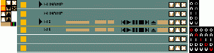
EQMAIN.BMP
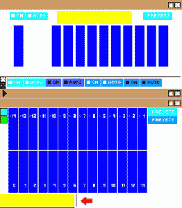
The main window of the equalizer is located here. All the necessary elements, including sliders and buttons are included in this file. A pure hell to the skinner. First of all, almost nothing could be done with the damned sliders, so you’ll have to invent something to make ‘em look better. After extraction you may get something like that:
Under the “background” of your EQ there is on/auto and “close” buttons’ animation. The white cross is for normal state, black is for pressed. (See EQ_EX.BMP for more info about min/max/close buttons.) On/auto buttons are placed in this order: inactive - active - pressed inactive - pressed active. Below there are two titlebar states - active (upper) and inactive (lower). 28 blue stripes are sliders (background), and on the left there are sliders thenselves - cyan is normal, green is pressed. On the right there are two states of ‘preset’ button - normal and pressed. The yellow rectangle below is the ‘oscilloscope’ window. Notice two one-pixel black lines on its sides (marked with a red arrow) - the vertical one is used to display the ‘sinusoide’, as I call it, and the horisontal line will be moved whed you move the ‘preamp’ slider. Of course you can fill the right stripe with a gradient. A good and fast way of creating a nice-looking oscilloscope is to copy-paste one-pixel stripes from somewhere on the window and then adjust their hue-saturation to anything you like.
Tricks: you could cut off the region which indicates the equalizer’s state. It’s useful sometimes. Other heroes might also cut off sliders and only leave a shape. What for? Many fans of the female sections try to find as much “free” space as possible, even by a price of usability. I think that if someone uses the EQ, he also has a right to see its state at any moment and adjust it as he wants, so try not to abandon the empty equalizer.
If you’re trying to ‘hide’ your sliders without killing usability, keep in mind that the slider stripe changes every time the slider gets two pixels up or down. That means that e.g. if you have some kind of a stripe under your slider, you should rise it by two pixels for each state stripe (look at eqmain.bmp of any skin that has unusual sliders, if you don’t understand). It took me a whole lot of time measuring every pixel to create wheel-sliders for FuturA skin!
MAIN.BMP
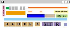
It’s the main image in your skin. This window is often made first and then used to extract buttons from it. Just remember that you better leave some of the elements of this image like posbar untouched after the extraction: they will be shown when no music is played. You may also place a logo in the visualization window which will be shown this way too. This window is often made first and then used to extract buttons from it.
The elements of this image file are (as shown on the picture): the header (gray) on the top is usually not shown in your final skin, as it’s often being replaced by a header from titlebar.bmp (well, till you’ve made something with it). But you may create a header here and then extract it to your titlebar.bmp. The same is true about the buttons: menu (on the left of the header), min/max/close... they are not normally shown but they could be used for extraction.
The five gray rectangles below are places where the time will be shown. The leftmost rectangle is used to display minus or stays empty, depending on the time display mode. Four others show minutes and seconds. The green rectangle on the left shows play/pause/stop signs (which are defined in playpause.bmp). An area below them (orange) is used for visualisation purposes. Keep in mind that it’s shown as it is drawn in the main.bmp only when the song is stopped. In other cases its view is described in viscolor.txt.
One small trick is continuing (or reflecting) visualization downwards (you can make a screenshot of your skin’s visualization and then fade or transform it), as there’s some free space between your visualization area and posbar.
A pink area (on the left) is used for some additional buttons (from top to the bottom): options (the same as right clicking on the main window), always on top, info (the same as options -> view file info Alt+3), doubled mode (Ctrl+D), advanced options. The big red stripe on the right is a song name scroller, where the song title is being displayed. Depending on your winamp settings it could be displayed by a default font or font from text.bmp. Two small orange boxes below are used to display song’s bitrate (the left one) in kbps (kilobytes per second) and the frequency in kHz Mono/stereo indicator’s field is indicated by yellow. The blue, light brown and lightgreen rectangles under it are volume, balance and eq/pl placeholders. The big light blue stripe is a position bar.
Don’t forget: when the song is stopped, you will only see a position bar from your main.bmp window, but not the image from posbar.bmp. Below there are 6 control buttons (from cbuttons.bmp) and shuffle/repeat switchers. The rightmost rectangle field is a place where normally a winamp logo is shown. This is not a button, it's just an area, clicking which activates winamp help. It’s almost never noticed by skinners due to its uselessness.
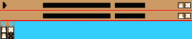
MB.BMP
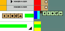
A damned minibrowser’s window. Why damned? Just because almost no one uses it. It’s very easy to skin (almost like the AVS window) and I won’t pay it any special attention, as there’s nothing interesting in it. Just don’t forget about repeating fragments.
The first two rows in the image are headers. The leftmost image (orange) is the left corner, the gray one is a header itself (it’s a good idea to place text there), the red rectangle is a repeating fragment and the rightmost (light brown) one is the right corner of our header. The “inactive” header is below. Two sets of rectangles, light brown and green, are buttons (back/next/stop/refresh/open URL). The rightmost set (green) displays a “pressed” state of the buttons. A green rectangle, divided into three parts, is the place where the opened URL will be displayed. Just note that the yellow fragment is repeating. And, as you might have already guessed, the black cross is the pressed state of “close” button.
MONOSTER.BMP

Mono/Stereo indicator. Most people don’t pay much attention to it, but here I’ll try to tell you a small trick I used in some my works. The image is divided into four parts, each of them indicates a state of mono/stereo sign at any time. In many cases skinners use two states: mono is on or stereo is on, so both indicators are visible at the same time. What if we don’t want it and only need to know if the song we’re listening to is mono or stereo? We create two lines of text (in Photoshop, for example): “mono” and “stereo”. Then rasterize them and cut each on the middle, so we got 4 text fragments: “ste”, “reo”, “mo” and “no”. Now we place them this way: “reo” is in the left upper corner, “no” is below, “mo” is in the right upper corner and “ste” is below. Now we’ve got a “steno” indicator, as I call it: it displays only “stereo” while playing a stereo song and “mono” while playing a mono one. But when no song is being played it just indicates meaningful “steno” :). You could use this trick to create your own mono/stereo indicators.
Well, if you don’t need that, you could make a classical indicator by following these rules: active “stereo” is left up, “mono” is right up and inactive states are located just below them. All is very simple!
Again, if you don’t want any mono/stereo indicator, you are free to leave it empty after extraction.
NUMBERS.BMP or NUMS_EX.BMP

Each of them is used to indicate numbers in your main window’s time display. In both cases you should begin from zero and end at 9. I recommend you to leave only nums_ex.bmp, as it also has a “minus” sign (on the right), displayed when your winamp’s time indicator is set into the “time left” display mode. You might place anything in these images, instead of simple numbers, but remember that unlike some other indicators, “time” is used very frequently, so it should be quite visibleand understandable.
PLAYPAUS.BMP

Play/pause/stop indicator, which is usually located (if someone uses it) in the main window left to the numbers, which display time. It has three states: playing (music is on), paused (the song is paused) and stopped (music is off). One simple small image. Remember that no one forces you to use the standard shapes on it: you could try something more specific.
PLEDIT.BMP
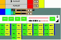
A single image for all playlist elements, even window shade, all cropped in a stupid way. You can first draw a separate image with the playlist window and then cut it manually or with help of a special program (see ‘skinning applications’ section.) A playlist is quite tricky to create - the problem is that it can be stretched to any size, so you’ll have to make repeating frame borders smooth and ‘seamless’. And because of it you can’t add transparency to PL. One more problem is an awful buttons placement - they are in the bottom of the image (green for normal, yellow for pressed), and each button group has a thin stripe on the right (blue), which will be placed on left. The ‘Misc’ button, which is below other buttons of the ‘rem’ group, in fact will be placed above all them. To make things even worse, all the buttons are separated with 1 px. stripes. Easy, isn’t it? ;) I dunno what a madman invented this! To make PL look best you would apparently need to make such elemens as stripes in the left transparent, and if you’re going to do it manually you’ll spend hell much time on it. I know it, because I did so when designing my first skins. Don’t repeat my mistakes - download a button extractor program, which will save much precious time. And in any case you’ll need a template.
On the very top there are headers, upper is active. Orange and light brown rectangles are left/right corners, grey is the header (it’s wide so you can place the skin’s title or anything else there), and the small red rectangle is the repeating fragment. On the right there is one more repeating element (yellow) from the lower part of the window. The bigger white rectangle will also appear on the bottom as you stretch the window. I think it’s supposed for visualization, but I’ve never seen it there :) Just a good place to put your logo. Below the headers all the elements are cluttered. The blue and cyan rectangles are the left/right edges of the window, pressed maximize/close buttons are easy to recognize (maximize button is for ‘normal -> WS’ state). There is a small but irritating bug with this button - if you’re testing your skin and see that this button is moving in an odd way, blame Nullsoft, not yourself!
Below these buttons there are sliders (cyan is normal, green is pressed). Next goes windowshade - the black rectangle is for text, the orange part will be repeated (playlist ws can be stretched, too). There is one left part for active and inactive states, and a right part for each of them (active is above). Apparently you won’t mark the active state in any way, but who knows... :) Finally, the rightmost little button is pressed ‘maximize’ (WS -> normal). Wide white stripe with buttons and other stuff will be on the bottom of the window (notice the 1-px stripe where the already described repeating element will be placed). The green buttons with the words ‘add’, ‘rem’, ‘sel’ and ‘list’ are, naturally, the ‘add’, ‘remove’, select’ and ‘list’ (file commands) buttons. In the pink windows time information will be placed. There are also small non-animated control buttons, which someone may use instead of the main window’s buttons. Anyway, no one does it, so feel free to ‘kill’ them and put anything on their place. The same is with black triangles for scrolling the playlist (everyone uses the slider) and the big triangle that is supposed to prompt that the playlist window is resizable. Below there are that damned buttons that I’ve already described. Phew, that’s all!
Some people trend to separate add/rem/sel/misc/list buttons on the playlist with the animated popup menus. I don’t think that this is a good idea. Popups look “alien” there. Generally speaking there are skins, like Windows 98, where the idea of popups over main buttons is realized very well, but in many cases this is not true. For example, if you have round buttons and then create rectangle popups over them, it may look terrible. You could use a very good and well-known method (Vapor or almost any modern skin), when your buttons slowly turn into popups. It’s not too hard. For example, let’s take the add button. When you press it, you get two more: URL/dir/file. So if we make file (the lowest one) look like add, then there’ll be an effect of buttons which just roll up from “add”. Tricky? Not at all. Another good idea is to create a “transparent” popup. You just give their background the same color as we have given to your playlist. It’s very easy, but you create an illusion of the lack of background!
POSBAR.BMP

Posbar is winamp’s position bar (wittily, right?). It displays the position of the song and allows you to get fast access to almost any song’s fragment.
This one has almost no animation and is very easy to create. The only known and usable trick with posbar is that you could make the image a bit thinner, getting a smaller bar this way. This is sometimes useful when you need to get a smaller slider in order to save space or to make it a bit less visible. You can even cut off sliders of your posbar, but I don’t recommend doing that, as it turns your skin’s usability into zero. The same is true for all the tricks with smaller sliders (cutting off the right part of posbar.bmp): this only brings you bugs.
On the picture the rightmost green rectangle is the area of a pressed button, the middle one- normal and the big rectangle is a slider’s background, which is shown when the song is played (read the main.bmp paragraph for more details).
SHUFREP.BMP

This image contains shuffle/repeat buttons and equalizer/playlist switchers. Both of them are 3-state buttons, so there are a lot of possibilities for animating these buttons. You could also combine shuffle and repeat buttons into a single one and do the same with EQ/PL. You could see this kind of buttons in my Ballzzz 3 Honey skin or somewhere else.
It’s important to remember the place of each animated picture. Don’t muddle them up. The brown rectangles are the shuffle/repeat buttons. The “Repeat” image comes first! (It’s on the left.) Nevertheless it’s located on the right relatively to shuffle in your skin. So don’t bother yourself changing their places, just use button extractor. There are four images of each of these buttons: off, pressed and on plus the pressed state for off -> on transition. Top rectangles are used for the “off” state. Then pressed, on and off -> on pressed state.
The green rectangles are the eq/pl switchers. EQ is on the left and PL on the right, so it’s easier to use them. The top-left fragment is the inactive state, the one below is active and intermediate states are on the right of each of them (so off -> on is top-right).
Again, you can cut this image (like almost every element’s image) if you want to kill animation and reduce filesize.
TEXT.BMP
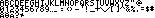
An image which has your main window’s font and which is used to display artist and song title. It’s also used in bitrate/kHz indicator and in playlist to display time. A thing to remember: while perverting with the font, keep in mind that the same font is displayed in several independent windows, so it might be hard to use some effects with it. Another limitation is that a size of a “cell” for each symbol is very small.
Note that a one-pixel vertical stripe between letters ‘A’ and ‘B’ is also used to fill ‘free’ space when a song’s name is short. You also shouldn’t put anything after the ‘@’ symbol - this part of the image is used as spaces in one of the playlist’s time indicators.
TITLEBAR.BMP
This image contains the main window’s titlebar, winshades, min/max/close and ‘options’ buttons animation plus clutterbar. There are two titlebar states - active and inactive (active above), the same with winshade, and below these four stripes there are two more, which aren’t displayed anywhere. You may type your name there and protect your skin from ripping.
In the left corner there are all the min/max/close and options buttons in all posssible states. The ‘options’ button is the orange square, stroked with red when pressed. Many skinners prefer not to draw this button (it’s absolutely useless), so you can leave it as it is after extraction. Next there go ‘minimize’ and ‘close’ buttons, white are normal, black are pressed. Below them there are four states of the ‘maximize’ button (from left to right, from top to bottom): normal, normal -> ws, ws, ws -> normal. Usually they are drawn like in this image, as if they had only two states, like ‘close’ and ‘minimize’. But you can use all the four states to make something non-standard, or make them have two states, but not ‘normal’-‘pressed’, but ‘active’-‘inactive’ (like in my skin ‘Greenie’). The brown rectangle is the posbar background (winshade) and the three small rectangles (red, green and blue) are the posbar sliders - the red one is displayed then the slider is below the middle, the green one - in the middle, the blue one - over the middle.
The ‘normal’ titlebar has nothing special on it - I’ve left buttons, but they won’t be displayed anywhere. Just write there your skin’s name if you wish. Winshades have a little bug - that orange 1-px stripe will be displayed in both active and inactive states. Just stroke your winshade with a 1-px border and you’ll get rid of the bug. In the brown windows time information, posbar and visualization will be placed. The black icons are the control buttons, bu they don’t have animation.
The clutterbar (O A I D V buttons) is on the right of the image. Pressed buttons are marked with red. Note that when you press a button, not only the pressed button, but all buttons are changed. But when the ‘always on top’ or ‘doublesize’ button is active, only the ‘pressed’ state of this button is shown, the rest of the clutterbar is taken from the above part (where all the buttons are white). In a few words - you can alwayss try to create something unusual, but in most cases you’ll get only bugs. Mind that besides ‘normal’ and ‘pressed’ states there is one more, ‘invisible’ state (gray buttons). It appears when you un-check ‘Always show clutterbar’ in Winamp display options. You may use it to create some interesting effects, but usually this ‘invisible’ state is just a copy of the ‘normal’ state.
VOLUME.BMP
All that has been said about skinning a balance also applies to the volume: you could crop the image to get a better animation and more interesting effects (like in Nucleo_Alien_Mind, Korea) than by using classical volume bars with sliders. On the image the upper (top) “cell” is corresponding with the minimal volume and the lowest (bottom) - with its maximum. Both volume and balance bars provide you with much more animation (up to 28 independent images) than any other skin fragment.